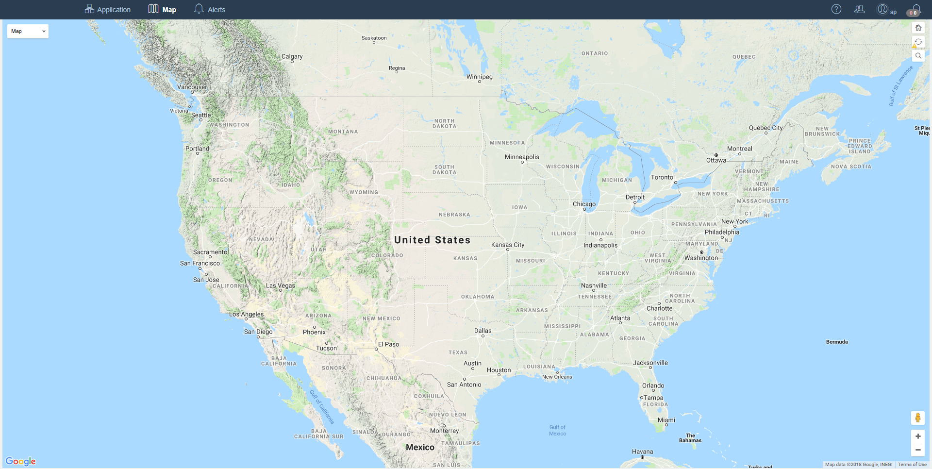
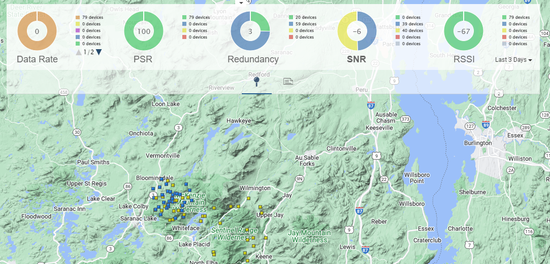
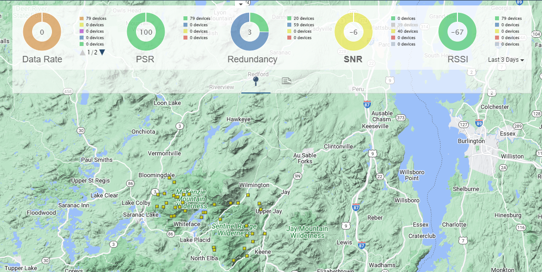
Device Maps
Device Maps are used to visualize End Devices locations.
By default, an Application may have too many devices to be displayed on the map. If this is the case a warning symbol will be displayed on the map refresh button  indicating the user is zoomed out too far.
After zooming in the Warning icon is removed from the map refresh button. This warning icon will disappear as soon as the zoom level is appropriate.
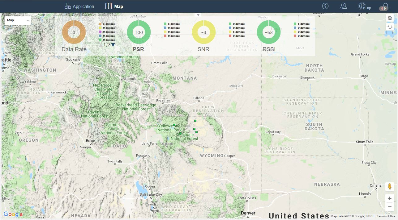
The square markers represent the GPS coordinates for the devices on a map.
Device Statistics
The map has a Device statistics header that shows RSSI, SNR, PSR,and Data Rate collected from the previous day. Redundancy is the average number of Base Stations per Device. Each statistic can be selected to update the status color of the Devices to match the statistic. For example, selecting the RSSI statistic will refresh the map and all devices will be colored by the RSSI value. The current value of a statistic is shown in the Information dialog shown by right-clicking a Device marker.
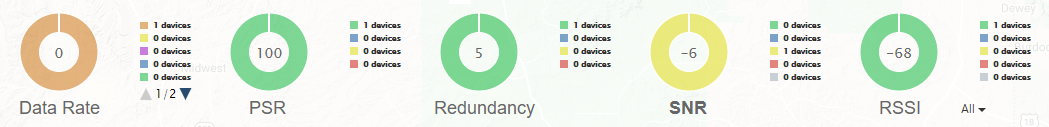
Clicking on a legend item from the selected statistic chart will toggle the display of the Devices for that category of the statistic. This also applies to the Service Metrics charts below.
Before selection of the blue legend item in the SNR chart:
After selection of the blue legend item in the SNR chart:
Special Cases
Base Station Analysis
When Base Station Analysis is active, the Redundancy Statistic is replaced with a Location statistic. The Location statistic shows the average number of Devices heard by the target Base Station for the previous day.
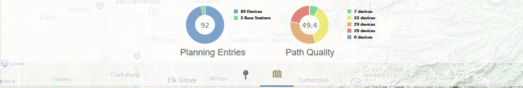
Planning Maps
When a Planning Map is active, an additional set of statistics including Entries and Path Quality is visible from the header. The Entries statistic shows the breakdown of Devices and Base Stations included on the Planning Map. The Path Quality statistic shows threshold groupings by Path Quality of all Devices on the Map.
The threshold values for the chart statistics are as follows:
| Data Rate | PSR | SNR | RSSI | Entries | Path Quality |
|---|---|---|---|---|---|
| DR 0 | Above 85 | Very Good SNR: > 1 | Very Good RSSI: > -95 | Device Count | Very Good Path Quality: > 75% and <= 100% |
| DR 1 | 50 to 85 | Good SNR: >= -1.5 and <= 1 | Good RSSI: > -105 and <= -95 | Base Station Count | Good Path Quality: >50% and <= 75% |
| DR 3 | 25 to 50 | Fair SNR: >= -4 and < -1.5 | Fair RSSI: >= -115 and < -105 | N/A | Fair Path Quality: > 25% and <= 50% |
| DR 4 | Below 25 | Poor SNR: < -4 | Poor RSSI: < -115 | N/A | Poor Path Quality: >= 0% and <= 25% |
| DR 13 | N/A | N/A | N/A | N/A | Unset |
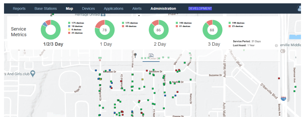
Service Metrics
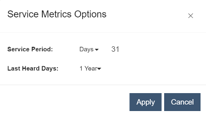
The Map's Device Statistics panel provides statistics that categorize Device reporting behavior for the selected time period. By default this is configured to be the last 31 days, but can be set to an arbitrary number of days less than 31. The data for a specific month within the last year may also be selected. Additional filtering of the Devices by the last heard time is provided to exclude inactive Devices from inclusion in the Service Metrics calculations. The charts can be selected to update the metric color of the Device pin.
Service Metrics Options
The gear button in the lower right corner of the Service Metrics tab launches a dialog for configuration of these values.
1/2/3 Day Chart
To help characterize the group of devices within the given Map view, device activity is measured using 1, 2, and 3 day periods: i.e. whether activity occurs every day, every other day, or every third day.
The first chart in the panel reflects counts of Devices whose activity is unique to each period-based metric. The green, blue and yellow sections represent the unique Device counts for the 1, 2, and 3 day periods respectively. The red section represents the count of Devices that have no activity occurring on a basis corresponding to these metrics.
Example:
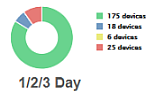 |
For the last 31 days: • 175 Devices had activity at least once a day. • 18 Devices had activity at least once every 2 days. • 6 Devices had activity at least once every 3 days. • 25 Devices have no activity on a 1, 2, or 3 day basis. |
Note
This chart does not include overlapping counts: e.g. where Devices with activity every day are also counted in activity every 2 and 3 days, etc.
1 Day, 2 Day, 3 Day Charts
The remaining Charts present three data points for each of the period-metrics:
-
Center Number Percentage of the total device population whose activity qualifies for the period-metric.
-
Green Segment Count of Devices whose activity qualifies for the period-metric.
-
Red Segment Count of Devices whose activity does not qualify for the period-metric.
Note
Individual period-metric charts include overlapping counts: e.g. where Devices with activity every day are also counted in activity every 2 and 3 days, etc.
Examples:
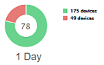 |
Count of Devices with activity at least once per day: 175. This is identical to the count from the first chart and 78% of the total Device count. The Device count of 49 matches the total of all the other counts from the first chart whose activity was less than once per day. |
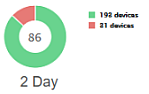 |
Count of Devices with activity at least once every 2 days: 193. This is derived by counting 18 unique Devices with activity every 2 days in addition to the Devices with activity every day (175 + 18 = 193). This is 86% of the total Device count. The count of 31 devices whose activity was less than once every 2 days is derived by reducing the non-qualifying count from the 1 Day chart by the number of devices whose activity now qualifies for the 2 Day chart: 49 - 18 = 31 |
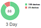 |
Count of Devices with activity at least once every 3 days: 199, or 88 percent of the total Device count. Notice again the qualifying Device count from the 2 Day chart increases by 6: the count of unique Devices with activity once every 3 days. i.e. The total number of Devices with activity every three days equals the number of Devices that uplink every 1, 2 and 3 days. The non-qualifying count from the 2 Day chart drops by the same amount to give the non-qualifying count for this chart: 31 - 6 = 25 |
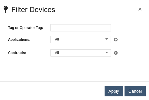
Filtering Devices
The Devices shown on the map may be filtered to those matching a specific Tag, one or more Applications and one or more Contracts.
To apply Device filters to the map:
-
Click the
 button
 -
Select the "Filter Devices" menu item
-
Update the Filter Devices dialog with the desired filters and click "Apply" to update the map to show only the Devices that match the applied filters.
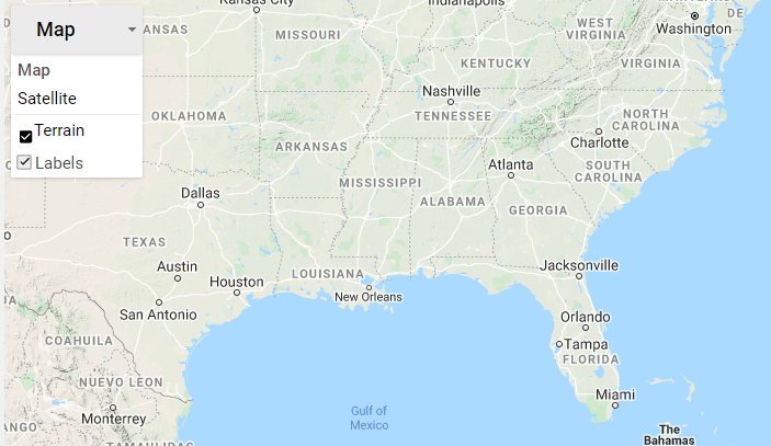
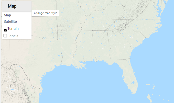
Filtering Map Labels
Road and point of interest features and labels are displayed by default on the Map. These can be disabled for a cleaner Map appearance by unselecting the Labels checkbox under the Map control.